Introducing Lyvera – a bold new brand offering all-in-one access to the greatest events on earth.
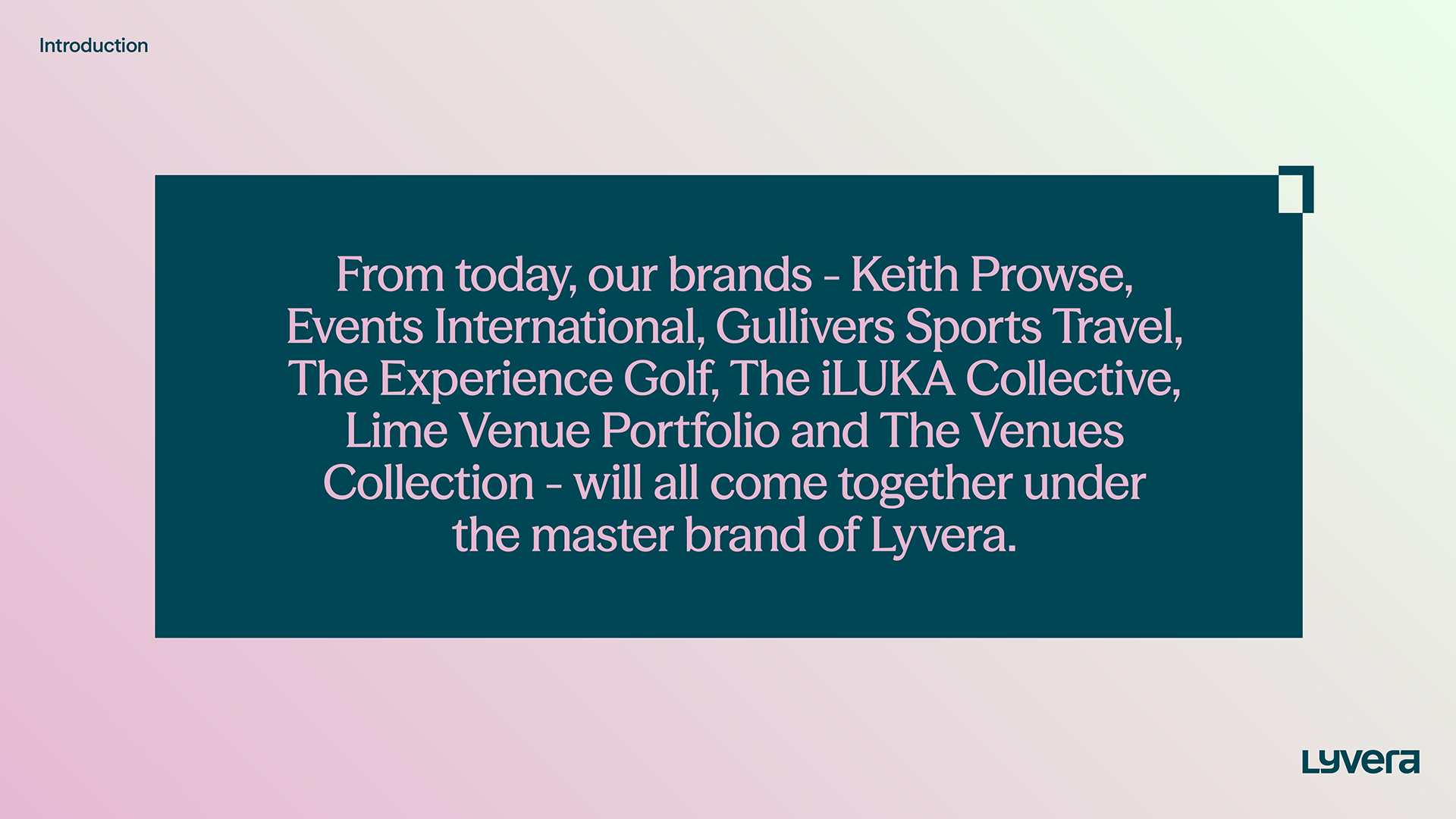
We were approached by the team at Levy, a global name in the hospitality and experience sector, who were looking to launch a new brand for an exciting new era. The new brand would allow Levy to bring together its sports, entertainment, and events businesses into one wrap around proposition.
It would introduce a simplified offer for clients, support the company to expand and scale into new territories, and generally help to strengthen its market presence.
Brand strategy & naming
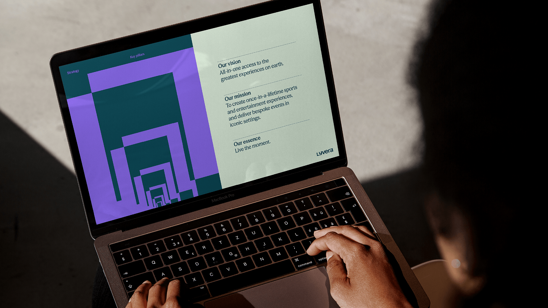
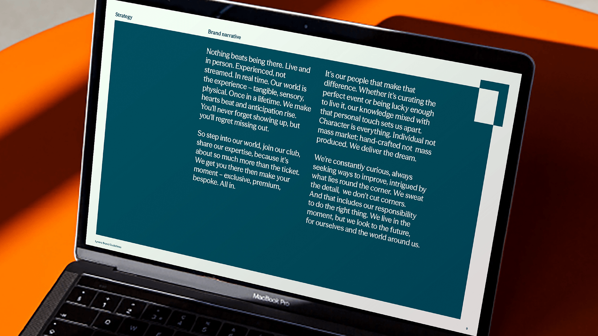
Through workshops with the team at Levy, we were able to better understand their goals for the new brand, which needed to flex and fit a variety of tones, while still feeling cohesive and fresh to ensure it could be utilised across the company's seven diverse sub-brands. We identified the emotion inherent in being present at live experiences as a key concept behind the brand, and created an overarching brand narrative that celebrated that emotion.
To come up with a suitable name for the new brand, we led a comprehensive naming exploration, ensuring that every potential direction was tested for its distinctiveness, longevity and impact. The name we landed on, Lyvera, captures the energy of live experiences while signalling Levy’s evolution into a bold new era.
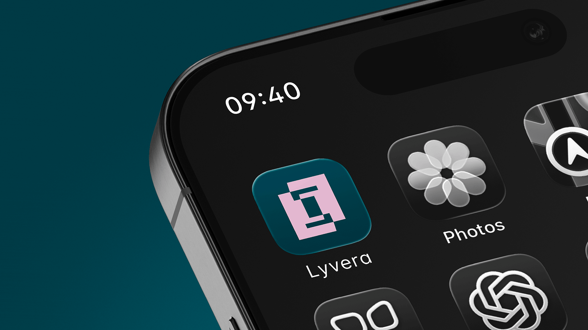
Logo
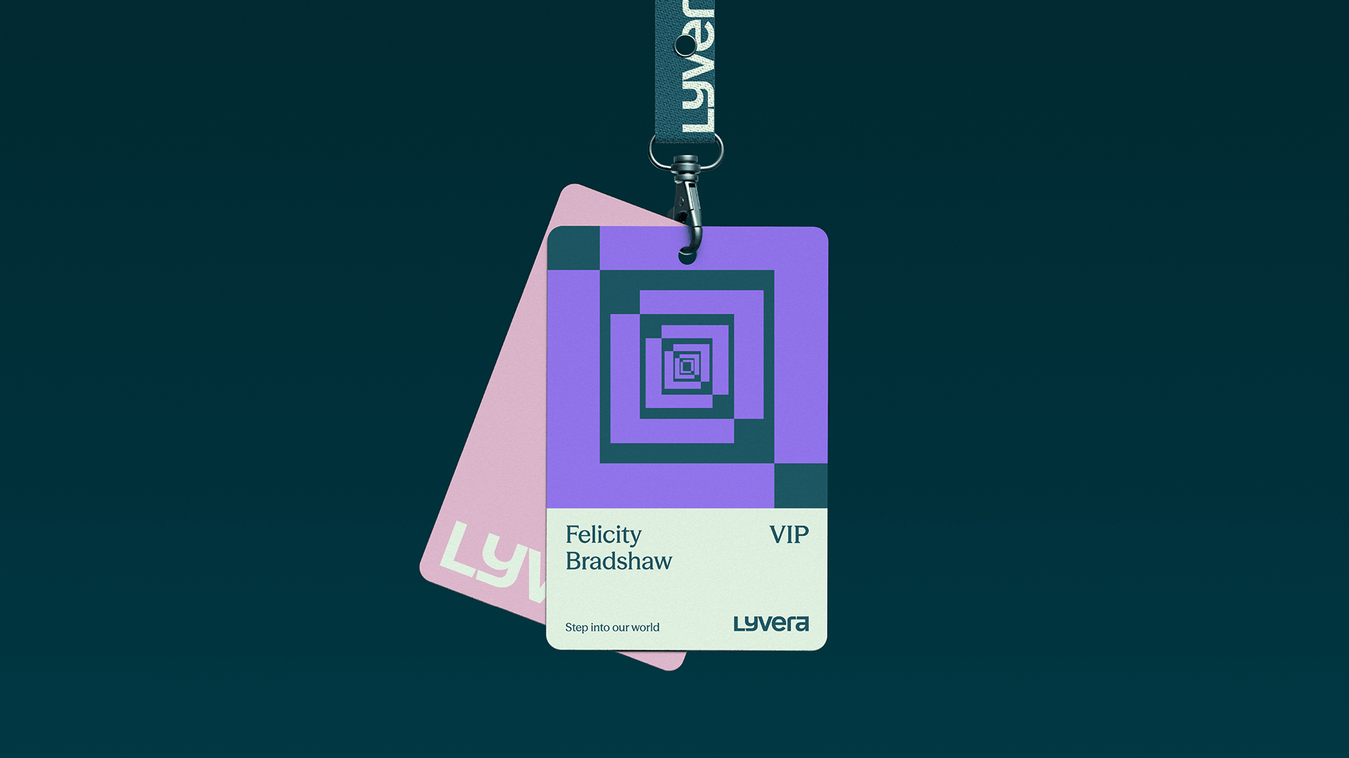
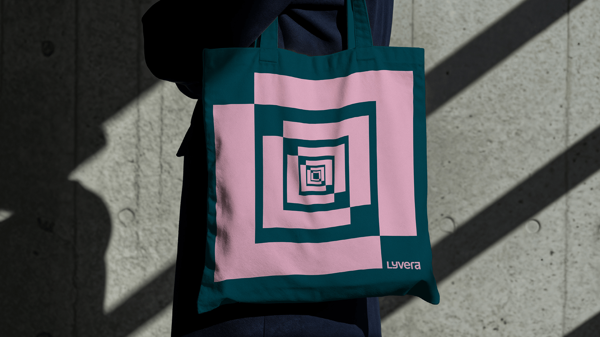
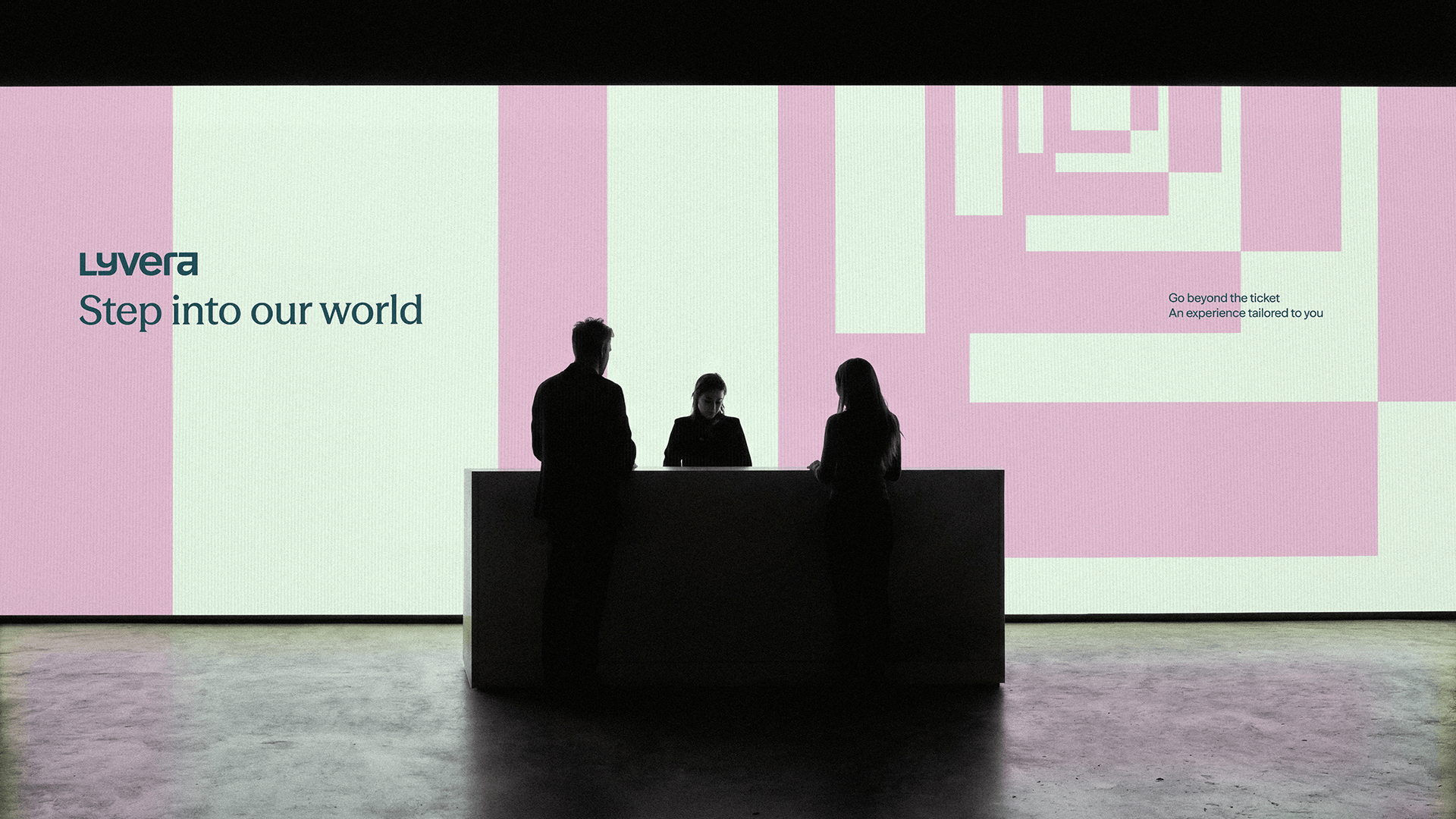
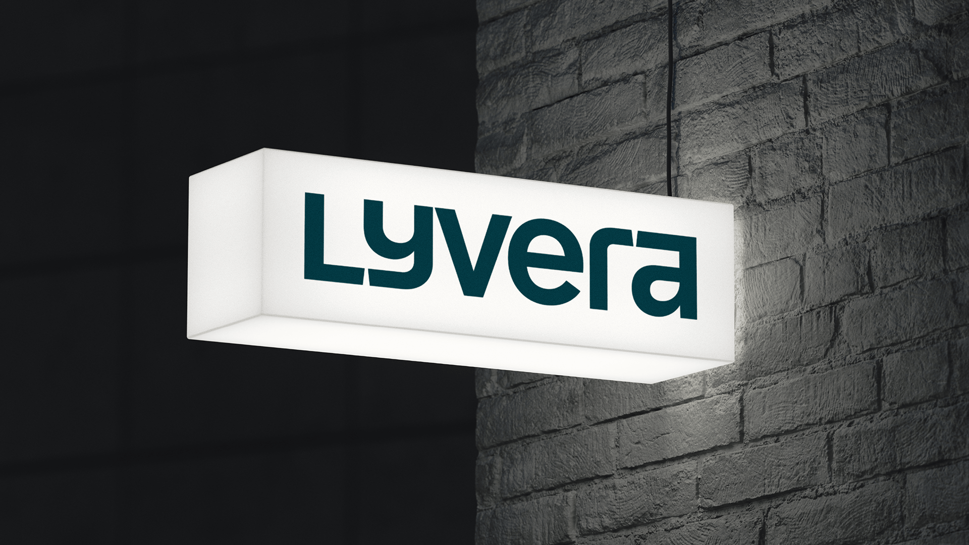
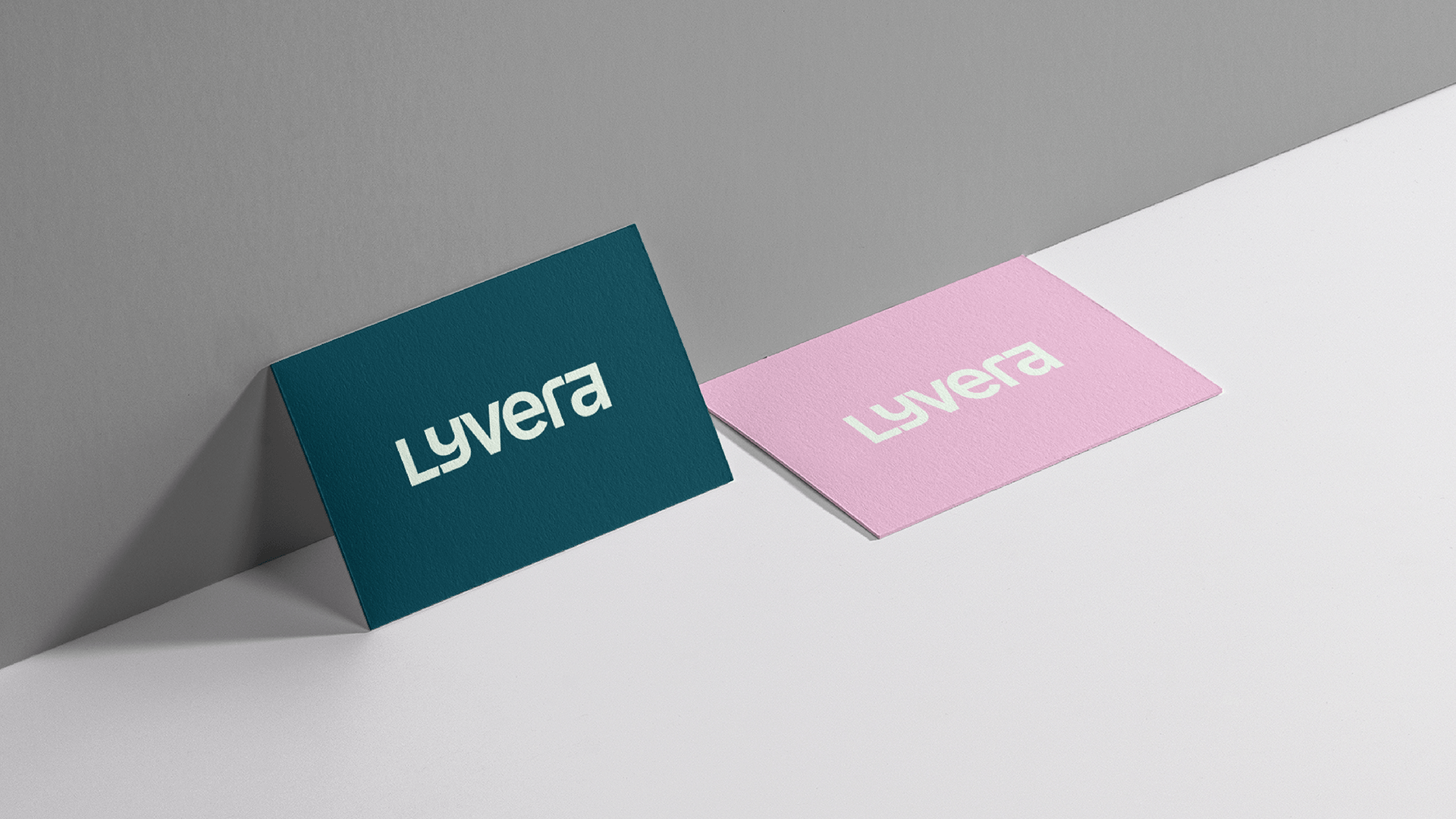
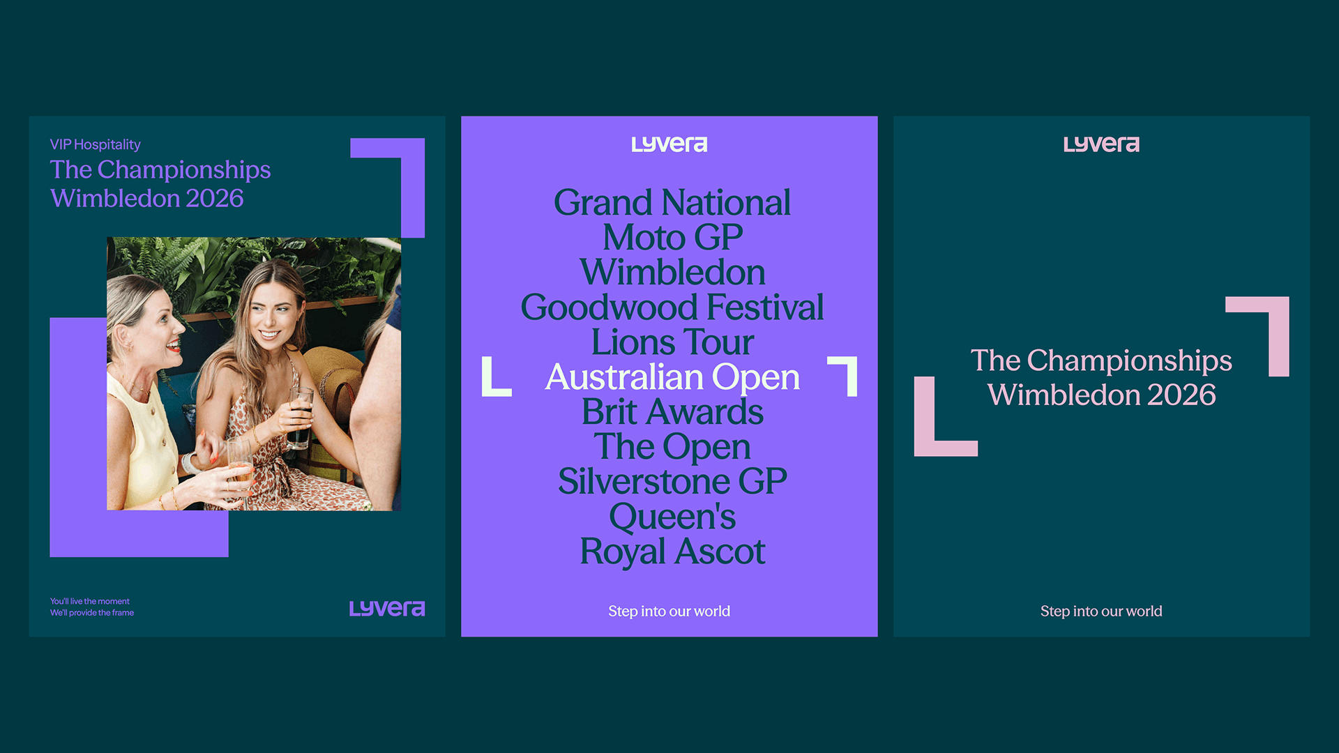
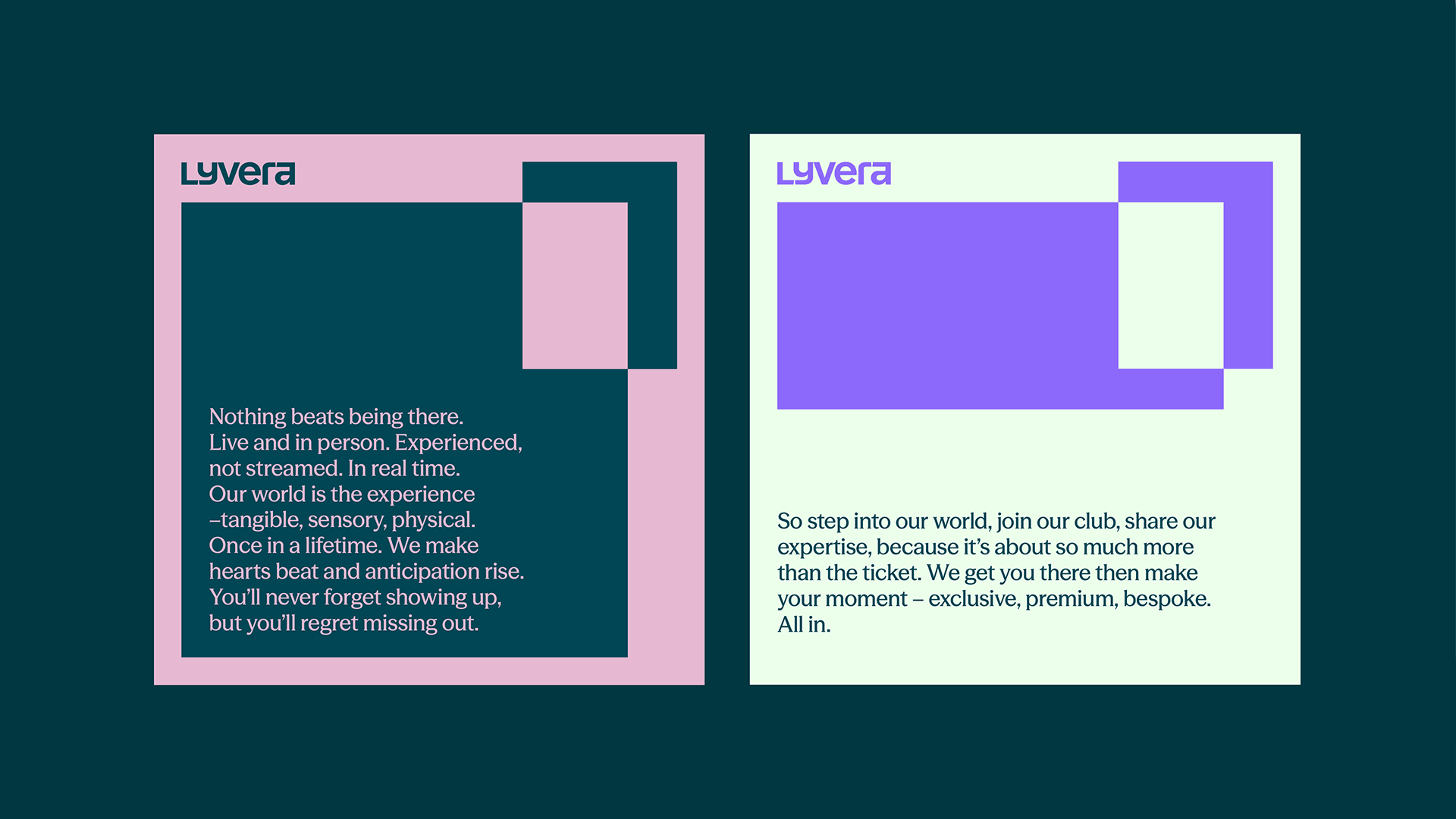
We chose the wordmark logo route for Lyvera to bring clarity to the brand, allowing the name to carry authority and recognition. We created a logo that would stand apart while also being flexible enough to be compatible with all of the company’s sub-brands. The wordmark features a framing device which is formed from the L and a of Lyvera, which became a core visual asset for the brand. We also created a shorthand symbol out of this frame, a bold, flexible mark that is only used across lifestyle-led applications.

Colour & typography
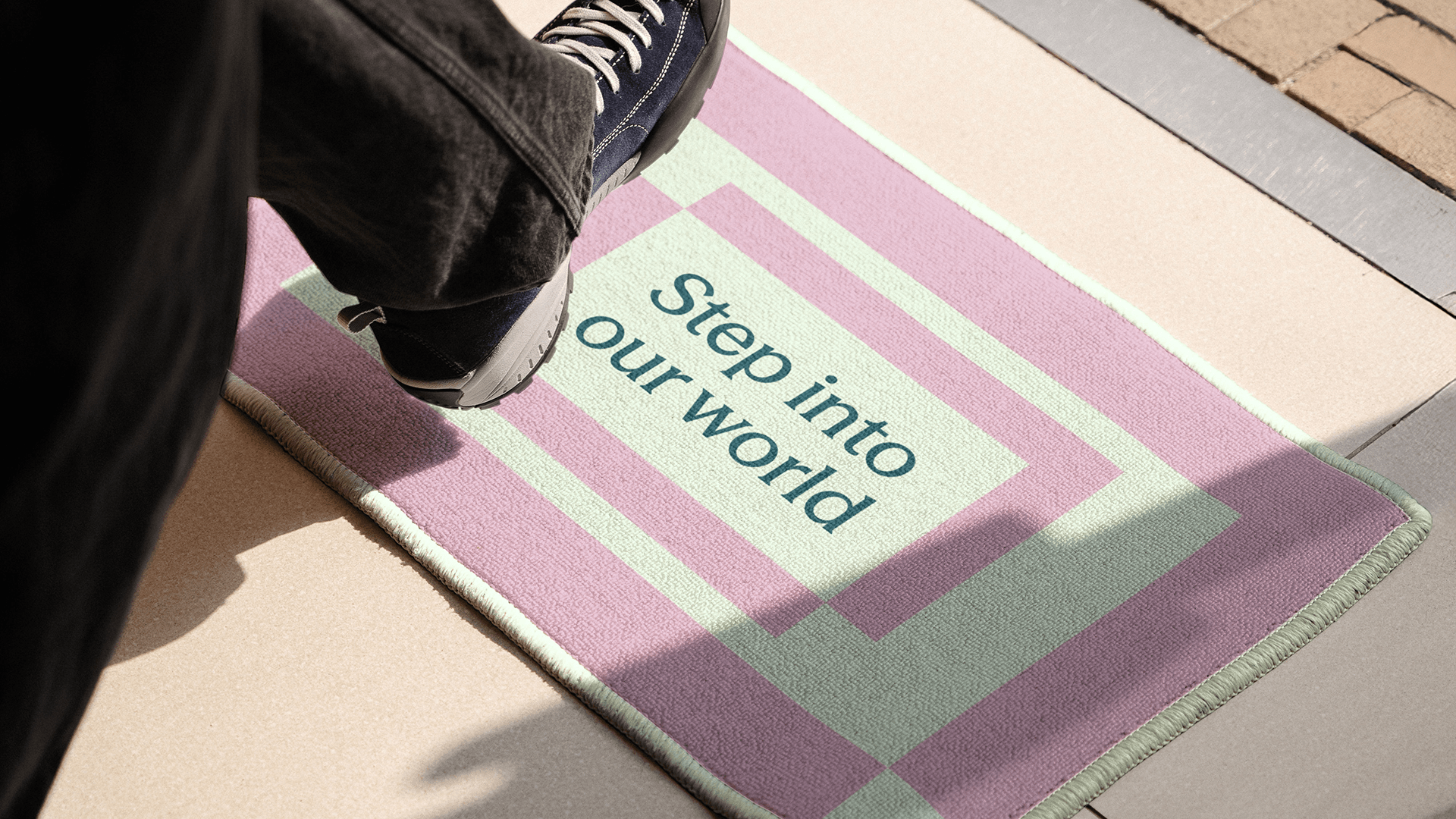
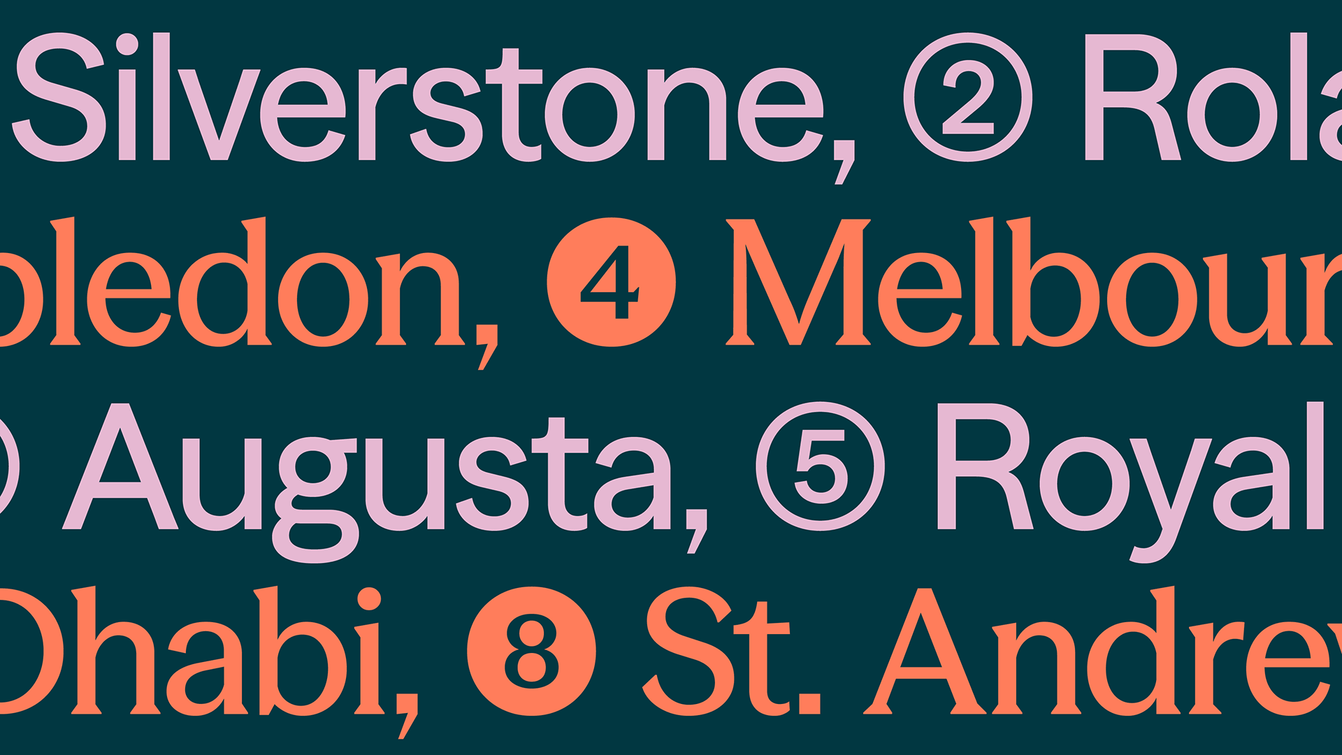
Built to flex across every environment, the colour system we created shifts from premium and aspirational to bold and contemporary. A considered mix of tones introduces greater depth and personality, with sophisticated hues like deep green and signature accents, such as muted pink, adding distinction and recognisability. The varied palette enables the brand to adapt fluidly across the full sporting and entertainment calendar without losing coherence.
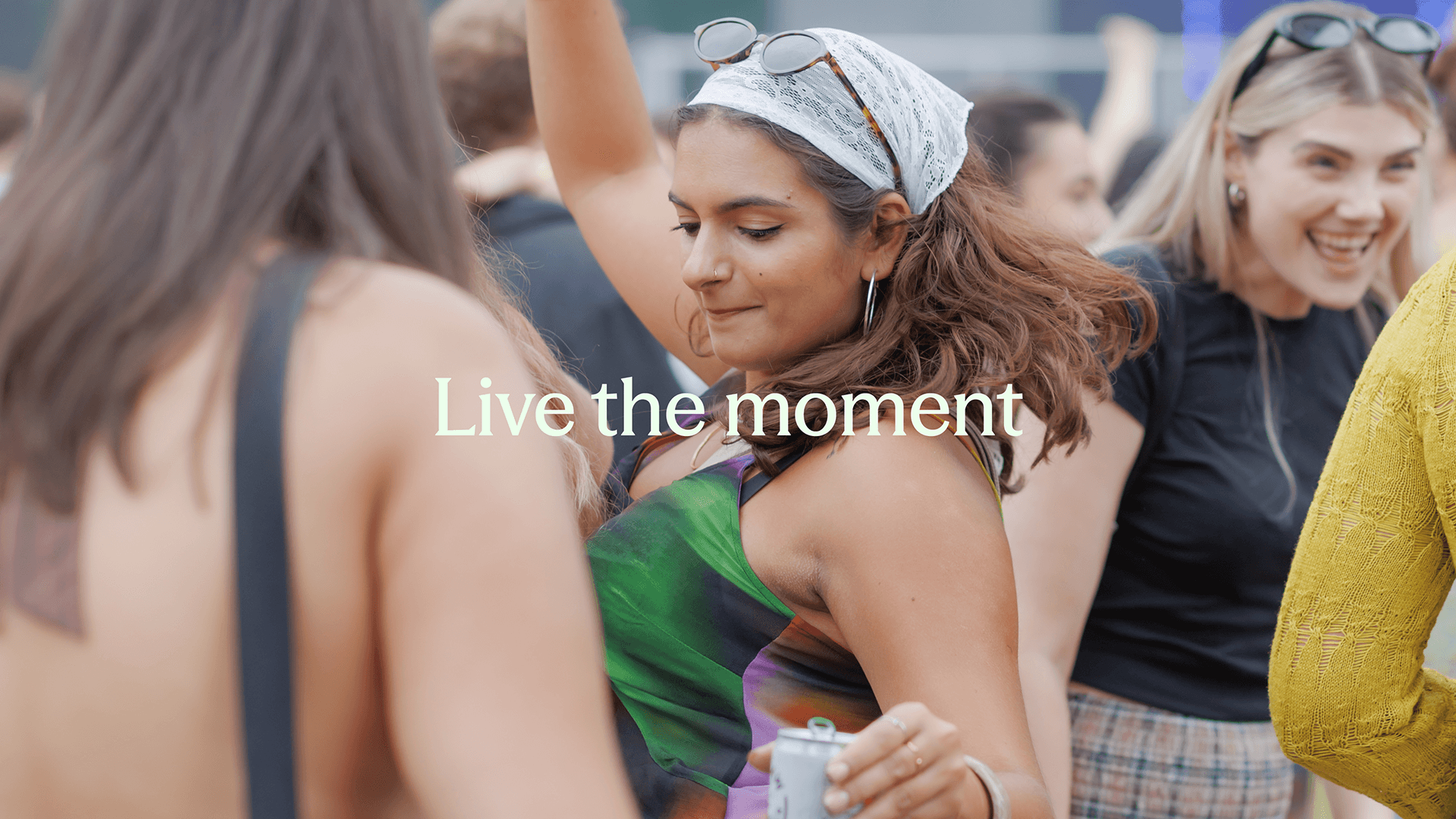
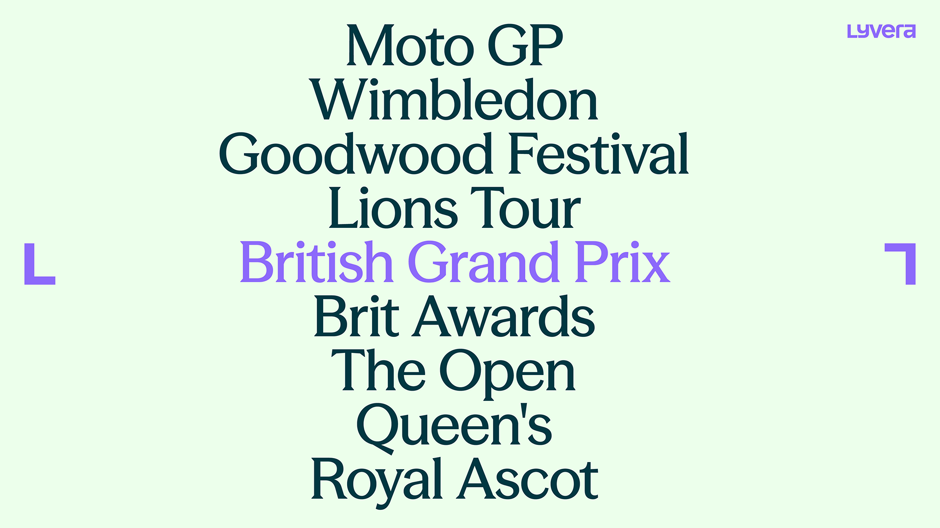
Like all of our work for Lyvera, the typeface also needed to flex to suit different moments and audiences. We chose the typeface Season, which can shift seamlessly between classic serif and modern sans as a variable typeface. The serif style brings elegance and sophistication to premium experiences like Wimbledon, while the sans style delivers energy and edge for contemporary events like the Brit Awards.
Framing moments
The Lyvera frame is a flexible graphic device that adds focus, directs attention and highlights key imagery or content – inviting the viewer to see the world from the Lyvera perspective and live the moment.
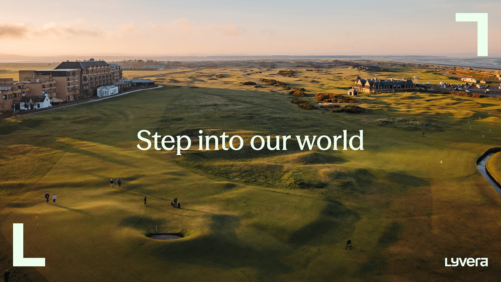
Portal
The portal is built upon the frame, a visual gateway that draws the audience in. Its layered form suggests movement and depth, echoing the feeling of entering an experience that unfolds with energy and discovery.