
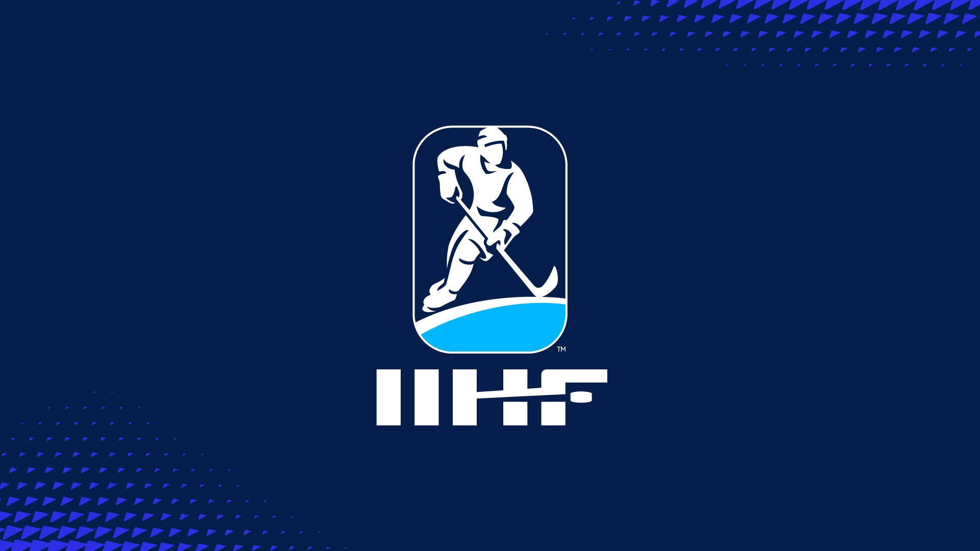
The brand includes an updated logo and wordmark, visual identity, graphic language, colour palette and bespoke font built around the brand essence Home Ice.
TwelfthMan worked closely with renowned icon artist Chris Mitchell to create the logo, which retains the IIHF’s brand equity by maintaining the silhouette of a player and its distinctive rink shape, but the gender-neutral player is now given more prominence and character.
A moving puck has been incorporated into the new wordmark, giving it a clear ice hockey reference as well as dynamism and personality. A bespoke typeface, meanwhile, captures the energy of the game with the flexibility to work in multiple tones across all levels of IIHF communications, from clear and confident to engaging and expressive.
